
Balanced Fitness & Health Website (WordPress) Redesign
The Challenge
Balanced Fitness & Health guides people through recovery from injury or surgery, management of chronic pain, and finding greater balance in their lives. They also serve businesses through corporate health programs and workers’ compensation rehabilitation. The existing website wasn’t communicating that clearly.
Audience Confusion
The site was creating confusion between the two audiences BFH serves: individuals seeking personal health and recovery support, and businesses looking for workplace health solutions. Visitors couldn’t quickly determine whether BFH was the right fit for their needs, leading to inquiries spent clarifying services rather than converting new clients.
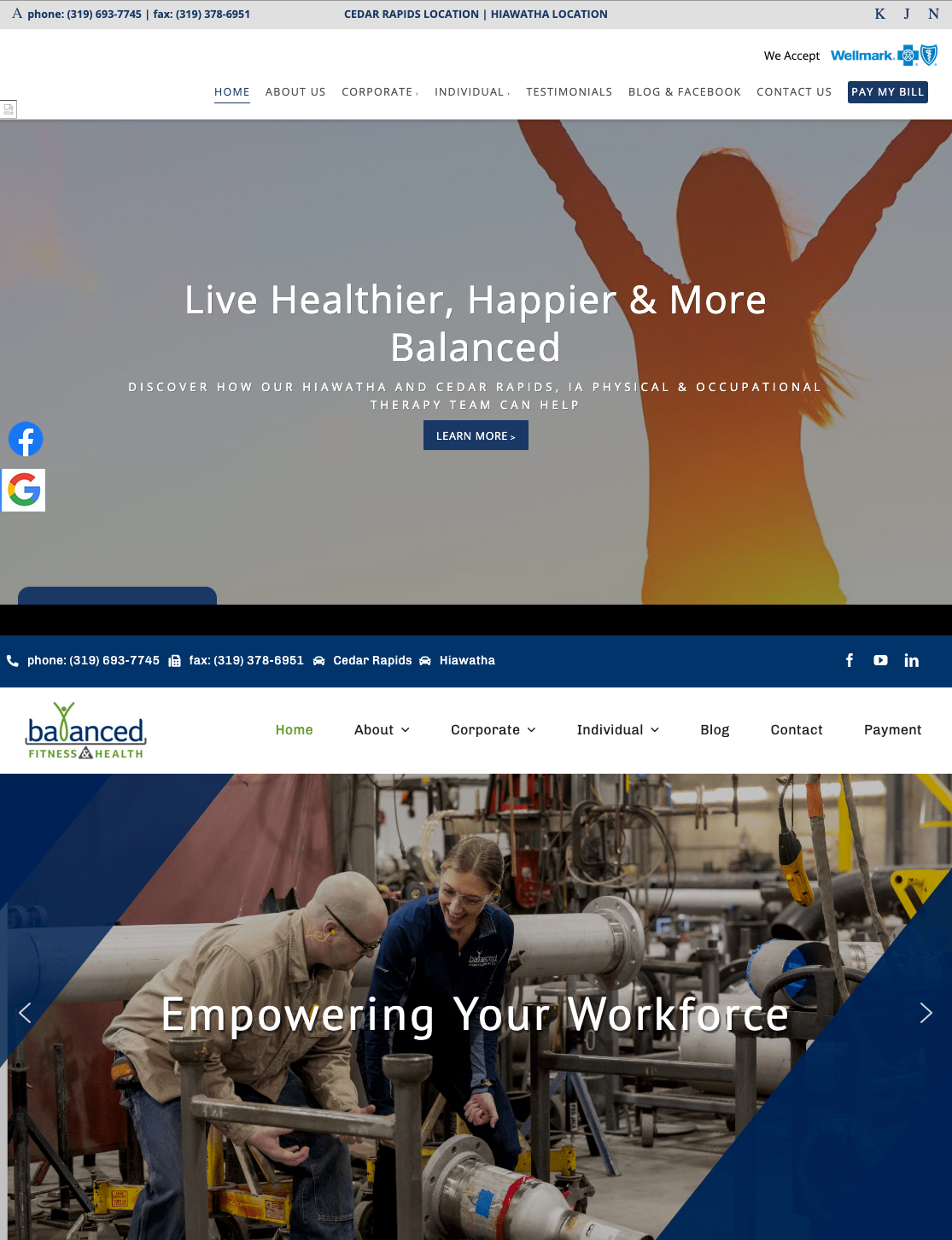
Branding Disconnect
The site’s appearance no longer matched the company’s updated branding. The visual experience was out of step with who BFH had become, undermining credibility before a visitor even read a word.
Mobile and Usability Issues
The existing site was difficult to navigate on mobile devices and didn’t present information in a way that made it easy for prospective clients to understand services and take next steps.
The Solution
The redesign focused on clarifying who BFH serves, aligning the site’s appearance with the company’s current branding, and making it easier for the right people to find the right services.
Branding Alignment
The visual design was brought in line with BFH’s updated branding, creating a consistent experience between the company’s identity and its web presence.
Clearer Service Communication
Content and navigation were restructured to help each audience — individuals and corporate clients — quickly understand whether BFH could help them and how to take the next step. Reducing service confusion was a primary goal of the information architecture.
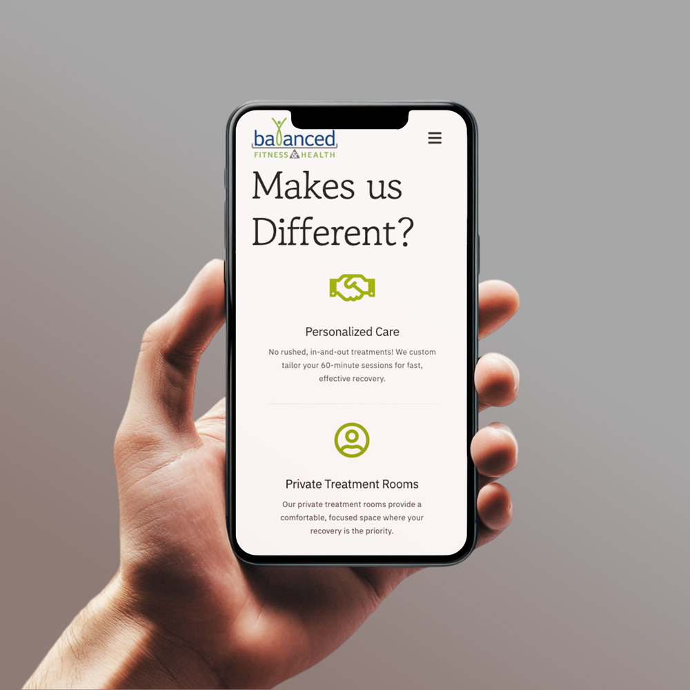
Mobile-Responsive Design
- Fully responsive across all devices
- Improved readability and navigation on smartphones
- Touch-friendly layout for easier interaction
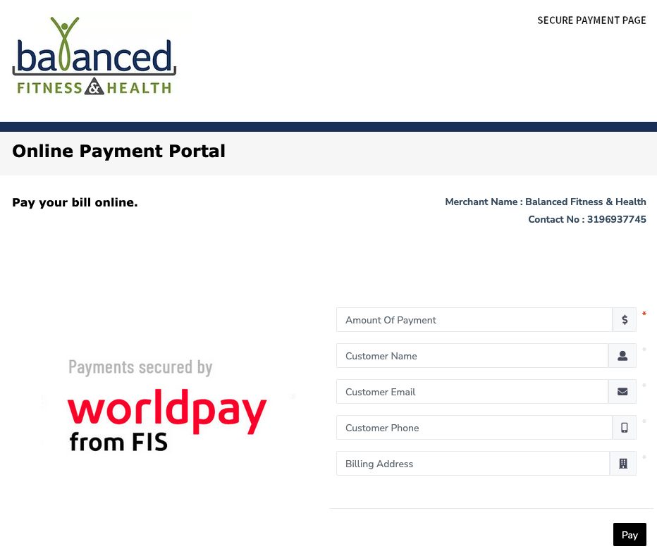
Payment Integration
Maintaining and extending the payment integration was a critical component of the project. Branding was carried through to the third-party payment experience to keep the client’s identity consistent at the point of transaction.
The Results
The redesign addressed the core problems and delivered measurable improvement in how BFH connected with prospective clients.
Reduced Service Confusion
Inquiries spent clarifying which audience BFH serves dropped by 35%, freeing up staff time and improving the quality of inbound contacts.
Increased New Client Inquiries
New client inquiry form submissions increased by 40%, reflecting a site that was doing a better job of communicating value to the right people.
Client Satisfaction
The owner reported that the updated site better represented the business and gave prospective clients a clearer picture of how BFH could help them.
Project Gallery
Interested in Similar Results?
Let's discuss how strategic design and marketing can help your business grow.
Start a Conversation