Prairie Star District Annual Conference Event Branding and Collateral
The Challenge
The Prairie Star District of the Unitarian Universalist Association needed to host a large regional conference with a small, volunteer-driven team and limited existing resources to guide the work.
Undefined Scope
There was no established playbook for the event’s informational needs, materials, or branding. Direction had to be developed from the ground up through research, experience attending similar conventions, and a close reading of the UUA’s organizational values.
Budget and Resource Constraints
With a volunteer staff and a modest budget, every design decision had to balance visual impact against practical production costs. Materials needed to work across multiple purposes without overextending the team or the budget.
Inform and Inspire
The event needed to serve roughly 250 attendees on two levels: practically, with wayfinding, schedules, and reference materials, and emotionally, reflecting the values and spirit of the Unitarian Universalist community hosting it.
The Solution
Research and preparation drove the approach. Attending similar conventions provided a working model for the types of materials and information attendees expect, which shaped both the scope of work and the design decisions.
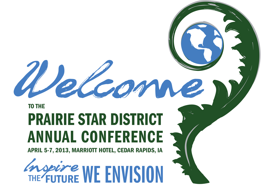
Brand Identity Rooted in UU Values
The branding drew directly from the principles and visual language of the Unitarian Universalist Association. Color, type, and imagery choices were made to feel consistent with the organization’s identity while giving the conference its own presence.
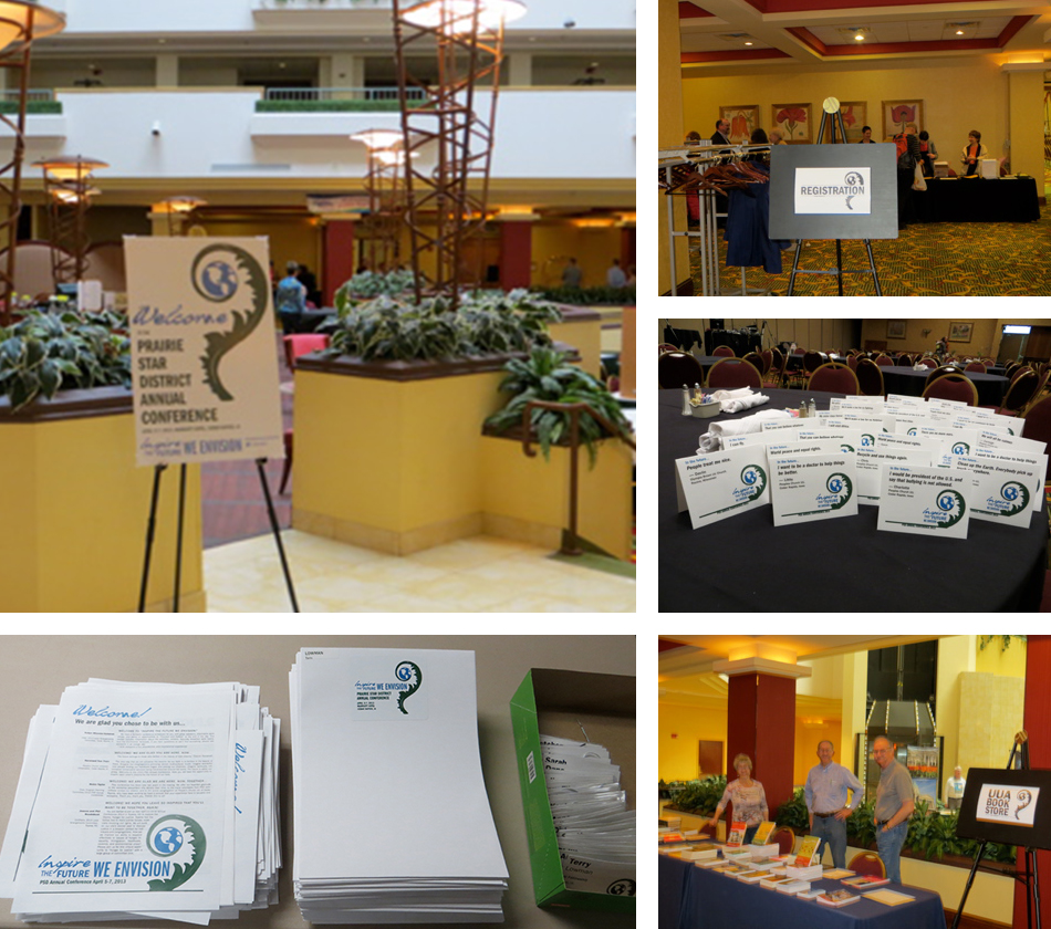
Collateral Designed for Real Use
Materials were developed with the volunteer staff and attendees in mind. Everything from the display board to the takeaway items had to be straightforward to produce, easy to distribute, and genuinely useful on the day of the event.
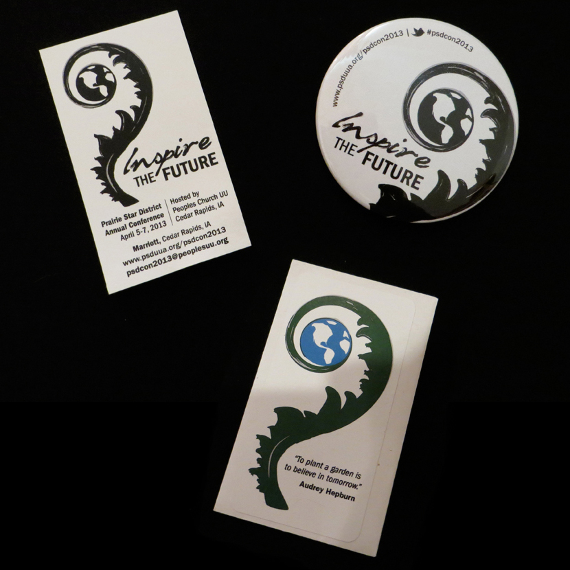
Thoughtful Takeaways
The three conference takeaways reflected the values of the organization. Business cards provided contact and reference information, event buttons created a sense of shared identity, and seed packets containing prairie flower seeds acknowledged both the district’s name and the environmental values central to the UU community.
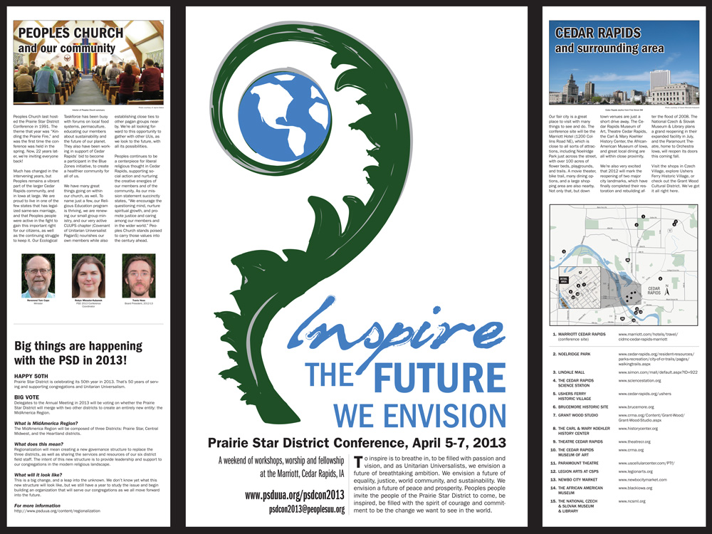
Wayfinding for Cedar Rapids
A triptych display board oriented visitors to Cedar Rapids, giving out-of-town attendees practical information about the host city alongside the conference materials.
The Results
The conference came together successfully for roughly 250 attendees, with materials that held up across the full scope of the event.
Stakeholder Response
Event stakeholders were impressed with how the conference came together. The client was pleased with the branding and the quality of the design and materials produced within the constraints of a volunteer-run budget.
Materials That Worked
Every piece served its intended purpose. Attendees had what they needed to navigate the event, connect with each other, and take something meaningful home. The seed packets in particular made an impression as a takeaway that aligned with the organization’s values rather than defaulting to standard promotional items.
A Foundation for Future Events
The system of materials developed for this conference gave the client a replicable model for future events, with branding and production standards that a volunteer team could realistically maintain.
Project Gallery
Interested in Similar Results?
Let's discuss how strategic design and marketing can help your business grow.
Start a Conversation